binscatter
A stata program to generate binned scatterplots.
binscatter is a Stata program which generates binned scatterplots. These are a convenient way of observing the relationship between two variables, or visualizing OLS regressions. They are especially useful when working with large datasets.
Installation
Open Stata and install binscatter from the SSC repository by running the command:
ssc install binscatterAfter installing binscatter, you can read the documentation by running help binscatter. The Examples section of the help file contains a clickable walk-through of binscatter's various features.
Introductory Slide Deck
This slide deck provides a thorough introduction to binscatter. It explains:
how binscatter generates a binned scatterplot
why a binned scatterplot is a meaningful representation of an OLS regression coefficient
how to interpret binned scatterplots
how binscatter can be used to graphically depict regression discontinuities, regression kinks, and event studies
Technical Description
Binned scatterplots are a non-parametric method of plotting the conditional expectation function (which describes the average y-value for each x-value).
To generate a binned scatterplot, binscatter groups the x-axis variable into equal-sized bins, computes the mean of the x-axis and y-axis variables within each bin, then creates a scatterplot of these data points. By default, binscatter also plots a linear fit line using OLS, which represents the best linear approximation to the conditional expectation function.
binscatter provides built-in options to control for covariates before plotting the relationship, and can automatically plot regression discontinuities. All procedures in binscatter are optimized for speed in large datasets.
Example
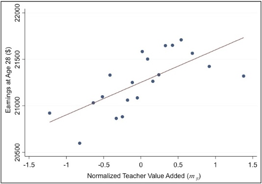
The following graph shows the relationship between quality of teaching in elementary or middle school and a student's earnings at age 28.

This graph is a visual representation of a multivariate regression with 650,965 observations. The regression finds that after controlling for a number of characteristics that affect student achievement (like class size and parental income), a 1 unit increase in Normalized Teacher Value Added is associated with a $350 increase in Earnings at Age 28.
The graph was created using binscatter:
binscatter first regressed the y- and x-axis variables on the set of control variables, and generated the residuals from those regressions. (Note that this is the first step of a partitioned regression. We could regress the y-residuals on the x-residuals and obtain the coefficient from the full multivariate regression.)
binscatter then grouped the residualized x-variable into 20 equal-sized bins, computed the mean of the x-variable and y-variable residuals within each bin, and created a scatterplot of these 20 data points. Each dot shows the average "Earnings at Age 28" for a given level of "Teacher Value Added", holding the controls constant.
Finally, binscatter plotted the best linear fit line, constructed from an OLS regession of the y-residuals on the x-residuals. The slope of the fit line matches the coefficient of the multivariate regression.
Source of Example: Raj Chetty, John N. Friedman, and Jonah E. Rockoff. 2013. "Measuring the Impacts of Teacher II: Teacher Value-Added and Student Outcomes in Adulthood." NBER Working Paper 19424. http://obs.rc.fas.harvard.edu/chetty/w19424.pdf
The graph above is Figure 2a in the paper, and the associated regression is reported in Table 3, Column 1.
Acknowledgements
binscatter is based on a program first written by Jessica Laird.
This program was developed under the guidance and direction of Raj Chetty and John Friedman. Laszlo Sandor provided suggestions which improved the program considerably, and offered abundant help testing it.
Thank you also to the users of early versions of the program who devoted time to reporting the bugs that they encountered.